
Selling on Etsy: The Perfect Product Photo Specs (Size, Format, DPI)
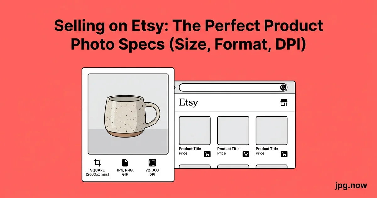
Etsy gives you ten photo slots per listing and treats the first one like prime real estate on a billboard. The shops that consistently outperform their category are not the ones with the most expensive cameras — they are the ones who export to spec, fill every slot strategically, and crop for the way buyers actually browse on a phone. Maya, a candle maker in Brooklyn, doubled her conversion rate in six weeks by changing nothing about her products and everything about her photos. Her secret was not a new camera. It was the discovery that her hero image was a vertical phone shot getting brutally cropped by Etsy's 4:3 thumbnail.
This article walks through the photo recipe Etsy's algorithm and human buyers actually reward in 2026, with the exact pixel specifications, the slot-by-slot template, the file-format decisions, the lighting setup that fits in a $90 budget, and the seasonal refresh cadence that keeps your top sellers on the algorithm's "active shop" list. Treat your shop photos as a conversion exercise rather than an artistic one and the numbers move within 30 days.
Background: how Etsy displays your photos
Etsy renders your uploaded image at different sizes depending on the surface. The mobile app search result shows a roughly 300-pixel-wide thumbnail. The desktop search shows about 400 pixels. The listing-page main image goes up to 1,600 pixels on a Retina display. The pinned-to-Pinterest version is 600 pixels wide. Etsy creates all these variants from a single uploaded master.
If you upload an image smaller than the largest display size, Etsy upscales it, producing visible softness. If you upload an oversized file, Etsy spends extra processing time and you waste your storage. The right starting file is large enough to crop cleanly for every surface but not so large that the upload times out on a slow connection.
The pixel specifications that matter
- Recommended long edge: 2,000 px
- Minimum long edge for sharpness: 1,500 px
- Aspect ratio for the main photo: 4:3 horizontal (Etsy crops to 4:3 in search results)
- Maximum file size: under 10 MB per image
- Format: JPG for photographs, PNG for graphics with text or transparency
- Color profile: sRGB embedded
- Max image count: 10 photos plus 1 video slot
Step-by-step walkthrough
Step 1: Plan the 10 slots before you shoot
Don't shoot first and edit later. The 10 slots are a story arc, and the shot list comes from the arc. Write down what each slot will be before you set up the lights:
- Hero: product centered on neutral background, 4:3 horizontal, fills 60 to 75 percent of frame
- Scale shot: product in a human hand or next to a familiar object
- Lifestyle: product in use, in context
- Detail close-up: texture, stitching, grain, finish
- Variants: all colors or sizes laid out together
- Packaging: what the buyer actually receives in the mail
- Dimensions overlay: measurements drawn on the image
- Materials shot: raw materials or sourcing story
- Alt lifestyle: different room or use case
- Logo / brand card: shop branding and care instructions
Step 2: Set up lighting on a budget
One large window plus a $25 foam-board bounce on the shadow side produces image quality indistinguishable from a softbox setup for 90 percent of Etsy categories. Shoot between 10 a.m. and 2 p.m. on a slightly overcast day for the most consistent color temperature. If you must shoot at night, two daylight-balanced 5,500 K LED panels cost about $90 and produce identical results year-round.
Step 3: Shoot 4:3 horizontal for the hero
Set your camera's aspect ratio to 4:3 or compose with crop marks for it. Vertical phone shots in slot 1 are the single biggest preventable mistake on Etsy. The 4:3 crop chops the top and bottom of a vertical and makes your product look small.
Step 4: Edit consistently across the set
Apply the same white balance, exposure, and color treatment across all 10 images. A buyer scrolling through your listing should feel like one consistent shop, not a Frankenstein assembly of mismatched lighting conditions. Lightroom's sync function or Capture One's clipboard adjustments handle this in two clicks.
Step 5: Export at 2,000 px long edge
One export preset:
- Resize long edge to 2,000 px
- Quality 90
- Color space sRGB
- Output sharpening for screen, standard amount
- Filename pattern: shopname_product-slug_NN.jpg
A typical jewelry shot at 2,000 x 1,500 px and quality 90 lands around 1.5 to 3 MB.
Step 6: Compress for upload speed
Run the batch through the JPG compressor to drop file size by another 30 to 40 percent. Etsy uploads faster, your listings publish faster, and the visual result is identical. A 10-photo listing drops from 25 MB total to about 15 MB.
Step 7: Handle transparency with PNG
For graphic overlays — text callouts, infographic dimensions, brand cards — PNG is the right format. If your designer ships a JPG with text and you wish it had transparency for an overlay, convert with the JPG to PNG converter. Note that the alpha channel will be empty until you actually mask out the background; conversion alone doesn't create transparency.
Step 8: Upload and preview on mobile
Upload to the listing in the order you want them displayed. Save the draft. Open the listing on your phone in the Etsy mobile app and scroll through. If the hero looks cramped, re-crop. If the colors look different than on your desktop, your monitor needs calibrating.
Background-style comparison
| Style | Best for | Notes | Difficulty |
|---|---|---|---|
| Pure white | Jewelry, electronics, small goods | Boost exposure +0.7 EV in post; pure white reads cleanest | Easy |
| Neutral textured (linen, wood) | Handmade goods, home decor | Adds warmth without distraction | Easy |
| Lifestyle in-context | Apparel, decor, gifts | Use as photo 3, not photo 1 | Medium |
| Bright color block | Bold accessories, kids products | Test against your brand palette | Medium |
| Marble or stone slab | Beauty, food, premium goods | Cheap from any home goods store | Easy |
| Black or dark moody | Whiskey, premium tech, dark beauty | Lighting precision required | Hard |
Common mistakes and how to avoid them
Vertical phone shots in the hero slot. Diagnosis: the hero looks great on your phone preview but tiny in search results. Fix: shoot horizontal 4:3 for slot 1. Verticals belong in slots 4 through 10 where the listing-page display can show them at full height.
Watermarks on the image. Diagnosis: buyers find watermarks tacky and Etsy's TOS discourages them. Fix: trust the platform. If a competitor steals your photo, file a DMCA — don't pre-emptively make your photos worse for paying customers.
Inconsistent backgrounds across the 10 slots. Diagnosis: hero is on white, slot 2 is on wood, slot 3 is on a beach. Fix: pick a visual system and use it across all 10. Pure white plus one lifestyle background is a common winning combination.
Files under 1,000 px. Diagnosis: photos look fine in your phone preview, terrible on a 27-inch desktop monitor. Fix: shoot and export at 2,000 px minimum.
JPG when you needed PNG. Diagnosis: text overlays in JPG have visible compression halos. Fix: text graphics ship as PNG. Use JPG to PNG if you have to upconvert.
All 10 slots showing the same angle. Diagnosis: buyer has no way to assess scale, materials, or use. Fix: vary the framing. Wide for context, medium for the product, tight for the detail. Different angles, not different crops of the same shot.
Real-world examples
Maya, candle maker in Brooklyn. Maya's first year on Etsy was photos shot vertically on her phone in her kitchen. Her conversion rate was 1.8 percent. She invested $90 in two LED panels, shifted to a horizontal 4:3 hero on a white background, filled all 10 slots strategically, and adopted the JPG compressor for batch optimization. Six weeks later her conversion rate was 4.1 percent. Same products, same prices, same listings — just photos that worked with the algorithm instead of against it.
Lars and Jonas, woodworkers in Stockholm. The brothers sell handmade cutting boards and serving platters. Their hero photos always showed the product alone on white, which Etsy rewarded with placement but did not convert well — buyers couldn't gauge size. Slot 2 became "board next to a hand for scale," and conversion lifted 24 percent in the first month after the change.
Priya, jewelry designer in Mumbai. Priya ships to international buyers and her old listings used Adobe RGB images that looked saturated in her editor but desaturated in the Etsy mobile app. After switching her export preset to sRGB and re-exporting her top 30 listings with the new preset, her favorite rate doubled in two weeks. She converted her bulk archive using the universal image converter to normalize formats from multiple photographers.
Advanced tips
A/B test your hero photo. Etsy does not provide native A/B testing, but you can do it manually. Swap the hero on Monday, note impressions and conversion for 14 days, swap back, compare. A 10 percent click-through improvement on a listing with 1,000 monthly impressions is 100 extra shop visits per month from one photo decision.
Use the video slot. Listings with video convert 12 to 30 percent better than listings without. A 10-second 360-degree turn or a hand-holding the product is enough. The video thumbnail still appears in the photo carousel, so treat it as photo 11.
Refresh seasonally. Your top sellers deserve a photo refresh every six months. Etsy's algorithm rewards "active shop" signals, and a fresh hero shot resets that signal.
Include a packaging shot. Buyers love seeing what arrives in the mail. The unboxing-experience slot drives a surprising share of conversion for gift-oriented products.
Photograph in batches. Set up the lights once and shoot 30 products in a session. Your per-product photo cost in time drops dramatically and consistency improves.
Calibrate your monitor. The number-one Etsy negative review is "color was different than the photo." A $200 colorimeter pays for itself the first time you avoid a costly return.
Use the SEO of file names. Etsy reads filenames as a minor ranking signal. handmade-lavender-soy-candle.jpg beats IMG_4823.jpg for discoverability.
FAQ
Can I use the same hero across multiple listings?
Yes, and many shops do for product variants. Etsy's algorithm will still treat each listing independently. The risk is that your shop page feels repetitive if every listing thumbnail is identical.
Does Etsy compress my photos?
Yes, on upload. Feeding it 2,000 px JPGs at quality 85 gives a better starting point than feeding it 5,000 px masters that get aggressively re-encoded.
Should I include text on my hero image?
No. Etsy discourages text overlays on the primary image. Text-bearing graphics belong in slots 4 through 10 and should be PNG for text crispness.
What if my product is naturally vertical (a long necklace, a tall vase)?
Shoot the hero horizontally with the product centered and breathing room around it. Use a 4:3 horizontal frame with the product running diagonally if needed. Save the full-height vertical shot for slot 3 or 4.
How do I handle product variants in one listing?
The hero shows the most popular variant. Slot 2 lays out all variants together. Slots 3 through 8 can each focus on one variant in detail or in use.
Are AI-generated images allowed?
Etsy currently requires that listing photos accurately represent the actual product the buyer will receive. AI-generated product photos are not allowed for the primary image; AI-generated lifestyle context that does not misrepresent the product is in a gray zone.
Should I shoot in JPG or RAW?
RAW for the master, JPG for the upload. Your editor handles the export from RAW to a clean sRGB JPG at the right dimensions.
Seasonal photo cycles
Etsy's algorithm gives a slight freshness boost to listings with recently updated imagery. The practical implication: rotate the hero shot of your top-selling listings every 4 to 6 months. The product is the same, but a new lighting setup, a different background texture, or a fresh prop choice signals "active shop" to the algorithm and "new" to repeat buyers browsing your shop.
Shop branding consistency across listings
Buyers who land on one of your listings frequently click through to your shop home page to see what else you offer. The visual consistency across your listings becomes a brand signal: shops with disciplined, repeatable photo styles convert browse-to-purchase at materially higher rates than shops with photos that look like they came from five different photographers. Pick a background, a lighting setup, and an edit style, then apply them across the whole catalog. The investment in shooting consistency pays off in repeat-visitor purchase rate.
Color accuracy and monitor calibration
The number-one Etsy negative review across categories is "color was different than the photo." Buyer expectations form from your hero photo and disappointment compounds when the physical product arrives looking different. Two technical issues drive most of these reviews: uncalibrated monitors and inconsistent shooting light.
Calibrate your monitor with a hardware colorimeter (Spyder X or Calibrite ColorChecker) at least every 90 days. Calibrate to D65 white point and a luminance of around 120 cd/m² for typical room lighting. Shoot a gray card or color checker as the first frame of every session so you have a reference for white balance in post. These two habits eliminate roughly 80 percent of color-related buyer complaints.
Pricing your shop photos against your margin
If your average product sells for $35 and converts at 2 percent, you need 50 listing views to make a sale. The hero photo determines whether someone clicks into the listing from search, and the secondary photos determine whether they complete the purchase. Doubling the conversion rate from 2 to 4 percent is functionally equivalent to doubling your advertising budget — without spending the advertising budget. The investment is one Saturday morning of better lighting and a careful 10-slot template.
For shops grossing $5,000 a month, a conversion-rate lift of just 15 percent adds $750 in monthly revenue. Over a year that's $9,000, and the photos last several years before they need refreshing. The return on a $90 LED lighting setup and a couple of afternoons of work pays back in the first month and compounds afterward.
Mobile-first composition rules
Over 75 percent of Etsy purchases happen on mobile in 2026. That changes what makes a good listing photo. Mobile screens are small, so detail-heavy images that look fine on desktop look cluttered on a phone. Strong silhouettes, single focal points, and clear color contrast against the background read at thumbnail size. Wide environmental shots — beautiful on a 15-inch laptop — disappear into a 300-pixel mobile preview.
Test every hero photo by viewing it at thumbnail size before publishing. If you can't tell what the product is from a phone-sized preview, the composition needs work — usually it means cropping tighter or simplifying the background.
Treat photos as the lever they actually are
Photos are not a creative exercise on Etsy — they are a conversion exercise with measurable upside. Get the specifications right, fill every slot strategically, and the algorithm rewards you with surface area. Push your next batch through the JPG compressor and the universal image converter, refresh your worst-performing listing first, and watch the numbers move. Bookmark the JPG to PNG converter for any text overlays you build along the way, and the image compressor for the high-volume cases where the basic batch compressor isn't enough. The shop you wish you had is one Saturday's worth of refresh work away.