Mobile Page Speed: The Image Optimization Checklist
It is Friday afternoon and a key account just emailed your CEO complaining that the product page "took forever to load" when they tried to share it with a coworker on a train. You open the page on your office Wi-Fi — 1.2 seconds, fast. You open the same page tethered to your phone outside the building — 6.8 seconds, painful. The hero image alone is 3.4 MB. The desktop version is invisible to this customer; the mobile experience is the entire brand impression. This is the conversation that turns "we should optimize images" into "we must optimize images by Monday."
Mobile bandwidth is the bottleneck. Even on a 5G connection, real-world median throughput is 30 to 60 Mbps with high latency variance, and a meaningful fraction of mobile sessions still run on 3G or congested 4G at under 5 Mbps. The single largest contributor to mobile page weight, on most sites, is images. Here is the full checklist that gets your mobile page under 2 seconds, in order from biggest impact to smallest polish.
Background: why mobile is the worst case
Mobile devices stack four constraints that desktops mostly avoid: variable bandwidth, high latency, limited CPU for image decoding, and small screens that punish layout shift. A 2 MB hero takes 200 ms to download on a wired connection and 4+ seconds on a flaky LTE link. Lighthouse and Search Console both report a "Mobile" score separately from desktop, and Google's ranking weighting prefers the mobile field data in most categories.
Step-by-step: the mobile optimization sequence
- Audit on a real phone using Chrome remote-debug or BrowserStack. Lab metrics underreport mobile pain.
- Identify the LCP element via PageSpeed Insights mobile view.
- Resize sources to roughly 2x the smallest target viewport width.
- Convert formats via JPG to WebP and JPG to AVIF.
- Compress via Compress JPG at mobile-appropriate quality.
- Implement srcset with 3 breakpoints.
- Lazy-load everything below the first viewport.
- Preload and prioritize the hero image.
1. Resize source images to mobile dimensions
The most common mistake is serving a 2,400 px image to a 380 px-wide phone screen. The phone downloads all 2,400 px of data, decodes it, and renders a 380 px version. A 400 KB download becomes a 12 KB download if you ship a properly-sized image. For mobile-first responsive design:
- Hero images: 800 to 1,200 px wide
- Body content images: 600 to 800 px wide
- Thumbnails: 300 to 400 px wide
Use srcset to ship different sizes to different viewports. The browser picks the smallest one that meets the display requirement.
2. Convert to WebP or AVIF
WebP cuts file size by 30 to 40 percent vs. JPG at equivalent visual quality. AVIF cuts another 20 to 30 percent on top of that. Mobile Safari and Chrome both support both formats in 2026. Convert your hero and body images via JPG to WebP and JPG to AVIF, and serve through a <picture> tag with a JPG fallback.
Per-image savings on a typical mobile hero: from 380 KB JPG to 240 KB WebP to 150 KB AVIF. Across 10 images on a page, that is 2.3 MB of mobile bandwidth.
3. Compress aggressively
Mobile screens hide a lot of compression artifacts. A JPG that looks crunchy at quality 65 on a desktop monitor looks fine on a 6-inch phone display. Practical mobile quality targets:
- JPG hero: quality 78 to 82
- JPG body: quality 72 to 78
- WebP everything: quality 75 to 80
- AVIF everything: quality 65 to 75
Run a sample through Compress JPG at these targets and view on an actual phone before committing.
4. Define srcset breakpoints
Three breakpoints handle 90 percent of devices:
<img srcset="hero-400.webp 400w,
             hero-800.webp 800w,
             hero-1600.webp 1600w"
     sizes="(max-width: 600px) 100vw,
            (max-width: 1200px) 50vw,
            800px"
     src="hero-800.webp"
     alt="..." width="800" height="500">
The browser computes which size to download based on viewport width and device pixel ratio. A 380 px screen at 2x DPR will fetch the 800w variant, not the 1,600w.
5. Lazy-load below-the-fold images
Add loading="lazy" to every image that is not in the first viewport. Browser-native lazy loading is supported across all major mobile browsers in 2026. The above-the-fold hero stays eagerly loaded — never lazy-load the LCP element.
Concrete impact: on a page with 25 images and a 5-image first viewport, lazy loading prevents 20 image downloads for visitors who bounce. That can save 4 to 8 MB per bounced session.
6. Preload the LCP image
Add to the document head:
<link rel="preload" as="image" href="hero-800.webp"
      imagesrcset="hero-400.webp 400w, hero-800.webp 800w, hero-1600.webp 1600w"
      imagesizes="(max-width: 600px) 100vw, 50vw">
This starts the hero download before the browser finishes parsing the rest of the HTML. Typical LCP improvement: 200 to 600 ms.
7. Set fetchpriority on the LCP image
<img fetchpriority="high"> tells the browser to prioritize this download above other resources. Combine with preload for the largest measured wins on mobile, where parallel-download bandwidth is constrained.
8. Set explicit width and height
Every image needs width and height attributes. The browser uses them to compute aspect ratio and reserve layout space before the image arrives. Without them, the page jumps as images load — a CLS (Cumulative Layout Shift) hit that Google reports separately from LCP.
Use the aspect ratio calculator to confirm width/height ratios match the actual image dimensions if your CMS does not autopopulate.
9. Strip EXIF metadata
Camera files carry 30 to 80 KB of metadata: GPS coordinates, camera serial number, lens info. Most of it is useless on the web and a privacy risk in some cases. Strip with jpegoptim --strip-all or Compress JPG (most web compressors strip by default). Per-image savings: 30 to 80 KB. Across 10 images: 300 to 800 KB saved.
10. Serve from a CDN
Mobile users are physically far from your origin server more often than desktop users. A CDN with global edge nodes — Cloudflare, Fastly, BunnyCDN — cuts latency by 100 to 400 ms on a typical mobile request. Combined with HTTP/3 (QUIC), which handles packet loss better than HTTP/2 on flaky mobile connections, this is a 5 to 15 percent total page-load improvement.
11. Use Save-Data and connection-aware loading
The Save-Data: on header is set by users who have enabled data saver mode in Chrome or Edge. Detect it server-side and serve lower-quality images:
if ($http_save_data = "on") {
    rewrite ^(.*)\.jpg$ $1-lowq.jpg break;
}
For users on slow connections, this can be the difference between a usable page and a timeout.
12. Audit the actual mobile result
Open Chrome DevTools, switch to Lighthouse, run a Mobile audit. The Opportunities section lists exactly which images are oversized, uncompressed, or in legacy formats. Fix the top 3 items, re-audit, repeat. Two iterations usually gets a page from a 40-something score to 90+.
Search Console's Core Web Vitals report shows field data from real mobile users — this is the score Google uses for ranking. Lab data and field data can disagree by 1 to 2 seconds; trust the field data.
Common mistakes and how to fix them
- Mistake: testing only on desktop Wi-Fi. Fix: throttle DevTools to "Slow 3G" or test on a real phone tethered to LTE.
- Mistake: using a single image size for all viewports. Fix: implement srcset with at least three breakpoints.
- Mistake: lazy-loading the hero image. Fix: set
loading="eager"on the LCP image and add fetchpriority="high". - Mistake: ignoring CLS while optimizing LCP. Fix: set width/height on every image to reserve layout space.
- Mistake: trusting Lighthouse over Search Console field data. Fix: monitor CrUX numbers; they are what Google uses for ranking.
- Mistake: not respecting Save-Data. Fix: serve lower-quality images when the header is set.
Real-world examples
Airbnb's mobile listing pages serve a sequence of dimension-appropriate WebPs via srcset, lazy-load below-the-fold gallery images, and preload the first hero. Median mobile LCP is under 2.0 seconds globally.
The Guardian's article pages use AVIF for hero images on Safari 16+ and WebP elsewhere, all served via Fastly. Their mobile Lighthouse score average across 1,000 sampled articles is 91.
A US retailer (anonymized) went from a mobile LCP of 5.4 seconds to 1.7 seconds by completing 10 of the 12 checklist items. Mobile conversion rate climbed 18 percent over the following quarter.
Mobile checklist comparison
| Optimization | Effort | Mobile LCP impact | Risk if skipped |
|---|---|---|---|
| Resize sources | Low | Large | Wasted bandwidth |
| WebP/AVIF conversion | Medium | Large | 30-50% larger files |
| Aggressive compression | Low | Medium | 10-30% larger files |
| srcset breakpoints | Medium | Medium | Over-large mobile downloads |
| Lazy loading | Low | Small (LCP) | Wasted TTI bytes |
| Preload + fetchpriority | Low | Medium | 200-600 ms LCP loss |
| CDN + HTTP/3 | Medium | Small | 100-400 ms latency |
The under-2-second checklist
- Source images resized to 2x display
- WebP and AVIF generated with image converter
- JPG quality 78 to 82, WebP quality 75 to 80
- srcset at 3 breakpoints
- loading=lazy on below-the-fold
- preload + fetchpriority=high on LCP
- width and height on every image
- EXIF stripped via Compress JPG
- CDN-served with HTTP/3
- Save-Data header respected
- Mobile Lighthouse score above 90
- Field data confirmation in Search Console after 28 days
Advanced tips
- Generate dominant-color placeholders via color palette as CSS backgrounds before the image arrives.
- Use
content-visibility: autoon below-fold sections to skip layout work on long pages. - Subset webfonts alongside images — a 200 KB font can be as costly as a hero image.
- Cache hero images aggressively with a long max-age and cache busting via filename hash.
- Inline a low-quality preview as base64 in the HTML for instant first paint.
- Use the image file size calculator to budget your byte counts up front.
- Test with throttled CPU in DevTools (4x slowdown) to simulate mid-range Android.
FAQ
Why does my page feel slower on mobile than my Lighthouse score suggests?
Lighthouse uses a lab profile that may not match your audience's actual network. Check CrUX field data.
Should I serve AVIF to mobile Safari?
Yes — Safari 16+ supports AVIF. Use a <picture> tag with format detection.
How small should mobile hero images be?
800 to 1,200 px wide is plenty for the largest current phones at 3x DPR.
Does lazy loading work on iOS Safari?
Yes, since Safari 15.4.
What about HEIC images from iPhone uploads?
Convert via HEIC to JPG on intake. Most CDNs do not understand HEIC.
Should I serve different images to 5G vs 3G users?
The Save-Data header is a good proxy. For finer control, the Network Information API exposes effectiveType.
Will optimizing images affect my organic search rankings?
Yes — Core Web Vitals are a ranking signal, and image weight dominates mobile LCP for most sites.
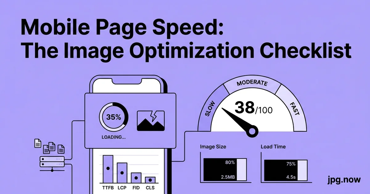
Real numbers from a mobile audit
Before: 8.2 MB page weight, LCP 5.1 s, mobile Lighthouse 38.
After: 1.4 MB page weight, LCP 1.7 s, mobile Lighthouse 94.
The wins compounded — no single change accounted for all of it. Resize cut 60 percent, WebP cut another 30 percent of what remained, AVIF cut another 20 percent. Lazy loading dropped initial bytes by 70 percent for the first paint. Preload trimmed 400 ms off LCP. Each change was small. Together they took the page from "user gives up" to "user does not notice."
Pick the top three items on the checklist you have not done yet. Push one image through compress image at your target settings, verify the result on a phone, then automate the rest in your build or CDN pipeline. The full checklist takes one afternoon and pays dividends every time anyone opens the site on mobile. Pair with the image converter and Compress JPG for ongoing maintenance.
The mobile-first viewport consideration
"Mobile-first" in design means the smallest viewport is the canonical layout. The same principle applies to images: design for the 380 px-wide phone and scale up to desktop. If your hero is 800 px wide in the mobile layout, that is the size you optimize for. Desktop visitors get larger srcset variants but the base case is mobile.
This inverts the legacy workflow where designers produced a 1,920 px desktop master and the engineer scaled down for mobile. The result of the inversion is that mobile images are intentionally sized rather than reluctantly downscaled, and the byte budget on mobile is the baseline rather than the afterthought. Sites that adopt mobile-first imaging typically see their mobile LCP drop 30 to 50 percent purely from the design change, independent of any code change.
Connection-aware image quality
The Network Information API exposes the visitor's effective connection type (4g, 3g, 2g, slow-2g) via navigator.connection.effectiveType. Pages can read this and serve different image quality accordingly. For visitors on slow-2g, serve quality 60 JPGs and skip AVIF; for visitors on 4g, serve quality 80 WebP or AVIF.
The implementation is JavaScript on the client picking the right srcset source, or server-side picking based on the Save-Data header. Either way, the gain on the slow tail is large — sometimes 2 to 3 seconds of LCP for visitors on weak connections. The middle and fast tail see no change because they already get the high-quality version.
App-in-WebView caveats
A meaningful fraction of mobile traffic comes from in-app browsers inside Facebook, Instagram, TikTok, Twitter, and LinkedIn. These WebViews are based on Chromium or WebKit but with subtly different behavior — older versions, restricted APIs, sometimes broken HTTP/3 support. Test your mobile site explicitly inside these contexts; lab Lighthouse runs in a clean Chrome and misses WebView-specific issues.
Common WebView gotchas: AVIF support lags real Chrome by 6 to 12 months, native lazy loading sometimes does not trigger correctly, and certain CSS layout features fall back to slower paths. The fix is conservative format choices (WebP + JPG fallback) and verifying performance inside the WebView via remote debugging from a Mac connected to the device.
Touch latency and perceived speed on mobile
Touch latency — the time between a tap and visible feedback — is a hidden contributor to mobile speed perception. A page that finishes downloading in 1.5 seconds but takes 300 ms to respond to the first tap feels slow. Heavy image decoding can monopolize the main thread for that critical first interaction.
Mitigate by deferring non-LCP image decoding via decoding="async", splitting JavaScript bundles so the initial parse stays under 100 ms, and avoiding long-running tasks during the first 2 seconds after page load. The Long Task API in Chrome DevTools shows main-thread blocks over 50 ms; aim for none of them between page load and the first user interaction.
iOS Safari quirks
iOS Safari has historical quirks around image rendering that desktop tools miss. Background-attachment: fixed on hero images causes severe scroll jank. Animated WebP support arrived in iOS 14 but with bugs around looping that persisted into iOS 16. CSS aspect-ratio works since iOS 15.4 but has subtle rendering differences from Chrome.
Test every change on a real iPhone, not just the Xcode simulator. The simulator runs the desktop WebKit and misses iOS-specific behaviors. If you cannot test on hardware, use BrowserStack or Sauce Labs for real-device testing in CI. The cost is a few dollars per test run; the value is catching bugs that desktop QA never sees.
Battery and thermal throttling
Modern phones throttle CPU performance when battery is low or thermally hot. A site that runs fine on a fresh phone can crawl on the same phone after 30 minutes of use. Image-heavy pages compound this because every image decode hits the GPU and warms the device.
Test on a thermally stressed device: leave the phone in a warm room, run a 3D game for 5 minutes, then load your page. The performance difference vs. a cool device can be 50 percent or more. Optimizing for the worst case (warm phone, low battery, congested network) gets you a site that feels fast even when the conditions are bad.