
The Definitive LinkedIn Banner JPG Guide: Sizes, Crops, and Text-Safe Zones
Current LinkedIn cover dimensions for personal profiles and company pages, the actual crop behavior on mobile versus desktop, and how to place taglines, logos, and CTAs so nothing gets cut off in either layout.
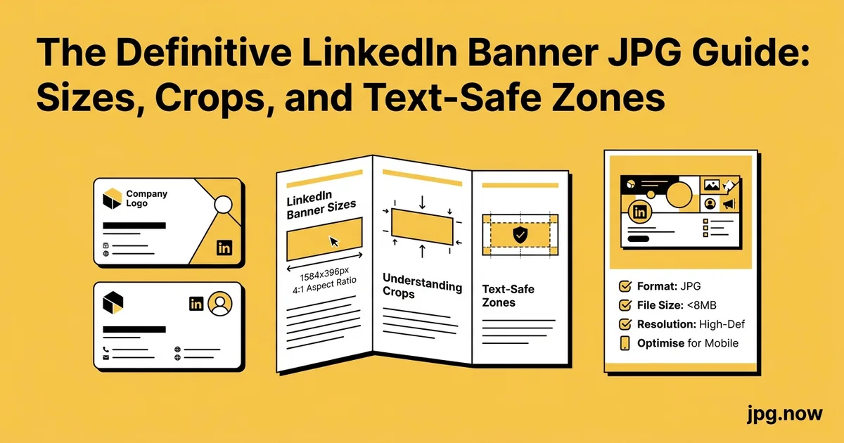
A founder I advised last quarter spent four hours in Figma building a LinkedIn banner that perfectly showcased her company's three flagship products. Three product screenshots arranged left to right, with the company tagline running along the bottom edge in a small italic font. The banner looked stunning on her 27-inch monitor at full size. When she uploaded it, her tagline disappeared behind her circular profile photo and the left and right product screenshots got cropped off on mobile. She did not realize until a recruiter messaged saying "I love your banner but I can't read the text" that the mobile crop and the profile-photo overlap zone had eaten the parts she cared about most.
LinkedIn banner images are the most consistently mishandled asset on the platform. The official specification has changed three times in the last five years, the mobile and desktop crops differ by hundreds of pixels, and the official preview in LinkedIn's upload tool does not match what actually displays once your profile is live. Here are the current 2026 specifications for personal profiles and company pages, the real crop behavior across devices, and the safe zones that keep your taglines, logos, and CTAs visible to everyone who lands on your page.
Background: Why LinkedIn Banners Trip People Up
The fundamental issue is that LinkedIn uses different aspect ratios on different surfaces. Desktop web shows the full 1584 x 396 image. The iOS and Android apps show a center-cropped version that is roughly 2.6:1 instead of 4:1, hiding about 25 percent of the width on each side. The profile-photo circle overlaps the bottom-left third on desktop and the bottom-center on mobile. None of these crop behaviors are visible in LinkedIn's upload preview, which shows the full image with the profile photo placeholder in the desktop position only.
The fix is to design with the cropping in mind. Use the center 1100 pixels for any content that must be visible to all viewers, the outer 242 pixels on each side for decorative-only elements that desktop viewers will see, and the top 286 pixels for content that should never be covered by the profile photo.
Current Dimensions (2026)
Personal profile cover: 1584 x 396 pixels, 4:1 ratio. Company page cover: 1128 x 191 pixels, roughly 5.9:1 ratio. LinkedIn accepts JPG, PNG, and GIF (no animation rendered). Maximum file size is 8 MB. Recommended file size for fastest load is under 1 MB.
If you are designing in Figma, Canva, or Photoshop, build your canvas at exactly these dimensions at 72 DPI. LinkedIn does not use DPI metadata, only pixel count, so anything beyond 72 DPI just makes your file larger without improving display quality. The aspect ratio calculator verifies your design hits 4:1 (personal) or 5.9:1 (company) exactly; an off-ratio file gets stretched or letterboxed on display.
Step-by-Step: Building a LinkedIn Banner That Works
- Open a new canvas at exactly 1584 x 396 pixels. Use Figma, Canva, Photoshop, or any design tool. Set the unit to pixels, not inches or millimeters.
- Mark the safe zones with guides. Vertical guides at 242 px and 1342 px (left and right desktop-only zone). Horizontal guides at 110 px and 286 px (above the profile-photo overlap).
- Place your main message inside the center 1100 px x 280 px zone. Tagline, value proposition, or hero text goes here.
- Use 48 pt or larger for any mobile-readable text. 32 pt becomes 7 pt on mobile and is unreadable.
- Avoid the bottom 120 px and bottom-left circle area. Profile photo covers this.
- Decorative elements can fill the side margins. Background patterns, brand color blocks, logo elements that desktop viewers will see.
- Export at JPG quality 90. File size lands around 400-800 KB at this quality.
- Run through compress JPG. Target 200-500 KB for fast page load.
- Verify dimensions in image info. Confirm exact 1584 x 396 before upload.
- Upload, then immediately view on both desktop and mobile to confirm crops.
The Mobile vs Desktop Crop Problem
Here is the catch nobody warns you about. On desktop, your full 1584 x 396 banner displays edge to edge with a circular profile photo overlapping the bottom-left third. On mobile (LinkedIn iOS and Android apps), the same banner is center-cropped to roughly a 2.6:1 ratio, which means about 25 percent of the left and right edges are invisible. If your tagline runs along the right edge, mobile viewers will not see it.
The safe horizontal zone (visible on both desktop and mobile) is the center 1100 pixels of your 1584-pixel-wide banner. That leaves 242 pixels of padding on each side that will only appear on desktop. Use those margins for decorative elements (background patterns, secondary brand color blocks) but never for text or logos.
The Profile-Photo Overlap Zone
On desktop, the circular profile photo sits 64 pixels from the left edge and overlaps the bottom 110 pixels of the banner. On mobile, the photo is centered but still overlaps the bottom 80 pixels. That means the bottom-left 240 x 110 pixels (desktop) and the bottom-center 200 x 80 pixels (mobile) of your banner are partially or fully covered by the profile photo.
Plan around this. Tagline text should sit in the upper two-thirds of the banner. CTAs and contact information should live on the right side (desktop-visible) or center-top (mobile-visible). Avoid placing anything important within 120 pixels of the bottom edge.
Company Page Specifications
Company pages use 1128 x 191 pixels, a thinner banner with no profile-photo overlap (the company logo sits to the left of the banner, not on top of it). The mobile crop is less aggressive: roughly the center 950 pixels are visible across both desktop and mobile. The thinner aspect ratio makes text hierarchy more important; use one large headline rather than three lines of small text.
For company pages, the social media image sizes reference includes the latest specs for company page banners alongside Instagram, X, Facebook, and YouTube, so you can prep a matching set for a brand refresh.
Common Mistakes and the Fix
- Mistake: Tagline runs along the right edge. Fix: Move all text to the center 1100 px zone so mobile viewers can read it.
- Mistake: Logo placed bottom-left. Fix: Profile photo covers this on desktop. Move the logo to the right side or top-center.
- Mistake: Text smaller than 48 pt. Fix: Larger fonts. Mobile rendering shrinks everything to 1/4 size.
- Mistake: 4:5 or 16:9 banner uploaded. Fix: Resize to exactly 4:1 (1584 x 396). LinkedIn letterboxes or stretches other ratios.
- Mistake: Pure white background with white profile-photo ring. Fix: Add a subtle color or pattern at the bottom-left where the photo sits, so the seam looks intentional.
- Mistake: Uploading PNG when JPG would work. Fix: Use JPG for any photographic content; PNG only for hard-edged graphics over solid backgrounds.
Text Sizing for Readability
LinkedIn renders banner images at the device's pixel density. A 1584-wide banner appears at roughly 850 pixels of width on a typical desktop browser and 320 to 380 pixels of width on a mobile phone. That means a tagline in 32 pt font on your canvas displays as roughly 17 pt on desktop and 7 pt on mobile.
For text that needs to be readable on mobile, use 48 pt or larger on the 1584-wide canvas. For desktop-only flourishes (think, "Helping founders since 2018" in small italics), 24 pt is fine. Test by viewing your design at 25 percent zoom in your design app; that approximates mobile display size.
Color, Contrast, and Background
LinkedIn does not apply any filters or overlays to your banner, but the profile-photo circle has a white border that draws the eye to the bottom-left. If your banner background is white or light, the profile photo seam disappears. If your background is colored, the white circle ring becomes a focal point, which can be a feature or a distraction depending on your design intent.
For contrast, aim for at least 4.5:1 between text and background (the WCAG AA standard). LinkedIn does not enforce accessibility, but light text on a busy photographic background is a guaranteed readability problem.
Real-World Examples
Example 1: The Solo Consultant. Pavel positions himself as a fractional CFO for SaaS startups. His banner: dark navy background, large white tagline "Fractional CFO for SaaS at Series A and B" centered, a small "Book a call" CTA on the right. Tagline reads on mobile. CTA visible on desktop. Total file size 220 KB after compress JPG.
Example 2: The Recruiter. Yara designs her banner around three icons representing the industries she recruits for, with their labels in 56 pt below each icon. The icons sit in the upper two-thirds of the canvas, well clear of the profile photo. She updates the banner quarterly with current open roles.
Example 3: The Company Page. A 12-person startup uses a 1128 x 191 banner with their wordmark on the left, a tagline in the center, and a small product screenshot on the right. The narrower ratio forces tight typography, which they treat as a constraint that improves their messaging.
Banner Specs vs Other Platforms
| Platform | Dimensions | Aspect Ratio | Profile Photo Overlap? | Mobile Crop? |
|---|---|---|---|---|
| LinkedIn Personal | 1584 x 396 | 4:1 | Yes, bottom-left | Yes, ~25% each side |
| LinkedIn Company | 1128 x 191 | ~5.9:1 | No | Light |
| X (Twitter) Header | 1500 x 500 | 3:1 | Yes, bottom-left | Light |
| Facebook Profile | 820 x 312 | ~2.63:1 | Yes, bottom-left | Heavy |
| YouTube Channel Art | 2560 x 1440 | 16:9 | No | Tablet/TV variants |
| Instagram (no banner) | N/A | N/A | N/A | N/A |
File Format and Compression
JPG at quality 85 is the sweet spot for LinkedIn banners. The platform re-compresses everything you upload, so starting with quality 100 just makes your upload slower without improving display. PNG is appropriate only if your design has hard-edged graphics over solid color (logos, sharp typography on flat backgrounds); for any photographic content, JPG is smaller and visually identical.
Run your final file through compress JPG with quality 85 selected to land between 200 and 500 KB. That uploads in under a second on most connections and meets LinkedIn's recommended sub-1 MB target.
Common Banner Mistakes
- Text within 120 pixels of the bottom edge. Profile photo crops it on desktop.
- Text within 242 pixels of left or right edge. Mobile crop cuts it off.
- 4:5 or 16:9 aspect ratio uploaded as banner. LinkedIn letterboxes the image with gray bars.
- Photo too detailed at small scale. Mobile viewers see a 380-pixel-wide thumbnail; intricate detail is lost.
- Wordmark logo in the dead-center bottom. Profile photo covers it on both platforms.
- Pure white background with white profile-photo border. Border disappears and looks broken.
Advanced Tips
- Refresh quarterly to signal an active profile. Recruiters and prospects notice stale banners.
- Use the right edge for a CTA visible on desktop. "Book a call" or "Now hiring" with a subtle arrow.
- Coordinate banner with profile photo background. Matching color or pattern creates visual continuity.
- Add a subtle gradient at the bottom 110 pixels. Helps the profile photo blend rather than pop out awkwardly.
- For dark mode users, banners render unchanged. LinkedIn does not invert your colors.
- Use aspect ratio calculator for variant sizing. Build sister banners for X and Facebook at different ratios from one source.
- Embed your URL or QR code on the right side. Desktop-visible, mobile-cropped, but viewers who care will click through to desktop.
A Build-and-Ship Checklist
- Build at exactly 1584 x 396 pixels (personal) or 1128 x 191 (company).
- Place key text in the center 1100 x 280 zone (desktop and mobile visible).
- Keep important content at least 120 pixels from the bottom.
- Use 48 pt or larger for must-read text.
- Export as JPG at quality 90.
- Compress through compress JPG to 200 to 500 KB.
- Verify final dimensions in image info.
- Upload, then view on both desktop and mobile within 5 minutes to confirm crops.
Frequently Asked Questions
Will LinkedIn ever change banner dimensions again?
Probably. Specs have changed three times in five years. Build with the current spec but keep your source file editable.
Can I use a video as a banner?
Not for personal profiles. LinkedIn Premium users can add a 30-second profile video that plays in the photo circle, but the banner itself remains a static image.
How often should I update the banner?
Quarterly is a good cadence. Updates signal an active profile and let you align with current priorities (open role, new product launch, conference appearance).
Does LinkedIn compress my upload?
Yes, lightly. A quality-95 upload becomes roughly quality-88 on display. Start at quality 90 to land at quality 85ish after their pipeline.
What size for LinkedIn Stories or carousels?
Different specs entirely. Stories are 1080 x 1920 vertical. Carousel posts are 1080 x 1080 or 1080 x 1350. See social media image sizes for the full reference.
Can I track who views my banner?
Not directly. LinkedIn analytics show profile views but not banner engagement specifically.
Does the banner affect search ranking?
No measurable effect on LinkedIn search. Profile completeness factors include having any banner versus none, but the design specifics do not affect ranking.
When You Need to Convert From Another Format
If your designer delivered a PNG and you want to compress it for LinkedIn, run it through the image converter with JPG output at quality 90. The conversion preserves the dimensions and color while cutting file size by 60 to 80 percent.
Design Patterns That Convert
The most effective LinkedIn banners share a few patterns. First, single-message focus: one tagline, one positioning statement, not a list. Visitors spend less than 3 seconds on your banner before scrolling to the experience section; you have time for one clear message. Second, visible CTA: a small right-side element directing visitors to your website, calendar, or recent content. Third, brand color anchoring: at least one element in your brand's primary color, even if the rest of the banner is neutral, helps tie the profile together visually.
Avoid stock photography of generic office scenes. Avoid quote graphics unless the quote is genuinely yours and short. Avoid logo dumps showing every client you've worked with; the social-proof signal weakens past 4-5 logos and the visual clutter hurts readability.
Iterating Based on Profile Analytics
LinkedIn Premium provides search-appearance and profile-view data. If you refresh your banner with a clearer positioning statement and see profile views climb 20 to 40 percent in the following month, the new banner is doing its job. If views are flat, the issue is probably your headline (more impactful than banner for search) or your industry positioning, not the visual.
For maximum traction, treat the banner as a quarterly experiment. Quarter one: clean tagline only. Quarter two: tagline plus CTA. Quarter three: tagline plus product/service icons. Quarter four: tagline plus customer logos. Note which variant correlated with the highest inbound message rate.
Accessibility and Inclusive Design
While LinkedIn does not enforce accessibility, designing for it benefits more viewers. Use high contrast (4.5:1 minimum between text and background). Avoid red-green combinations that color-blind viewers cannot distinguish. Avoid text smaller than 48 pt on the canvas (becomes unreadable on mobile). Use a sans-serif font that renders cleanly at small sizes; serifs lose detail at mobile scale.
Ready to ship a polished banner? Start with the aspect ratio calculator to verify 4:1 or 5.9:1 dimensions, finalize with compress JPG for upload-ready file size, double-check in image info, and use social media image sizes if you want matching banners for other platforms. All free and run in your browser.