
What Image Formats Print Shops Accept for Business Cards and Flyers
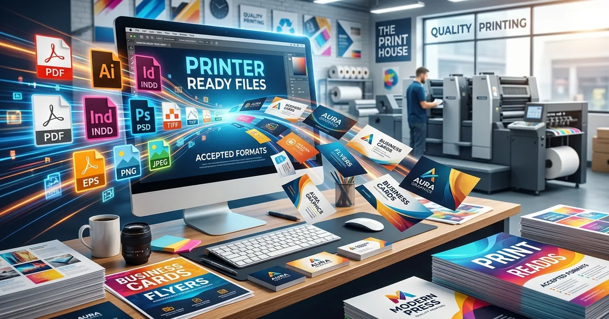
You spent an hour getting your business card layout just right. The logo sits perfectly, the font is clean, and everything on your screen looks polished. You head to the print shop's upload page, submit the file, and a few days later the cards arrive with soft text, murky blues, and a faint banding pattern across the background. None of that was in your original design. It all came from one source: the file you submitted did not meet the technical specifications the printing press requires. Getting those specs right before you upload is the difference between cards you hand out with confidence and a batch that goes straight to the recycling bin.
Print Shop Essentials
Print-ready files must pass three checks before they go anywhere near a printing press: format, resolution, and color mode.
- PDF (ideally PDF/X), TIFF, and high-quality JPG are the formats accepted by nearly every print shop.
- All artwork must be at least 300 DPI at the final print size, not the screen size.
- Files in RGB color mode will shift unpredictably in print; CMYK is the correct mode for any print job.
Why Your File Gets Rejected at the Upload Screen
Print shop portals run an automated check the moment you submit a file. This check scans for minimum resolution, accepted file types, color mode, and bleed settings. If your file fails any of those checks, it either bounces back immediately with an error message or gets flagged for manual review, which can stall your order by days.
The most common cause of rejection is a file saved for screen use. Apps like Canva, Google Slides, and even Photoshop include export presets labeled "web" or "screen." Those presets shrink the file by dropping the resolution to 72 or 96 DPI, which is the standard for monitors. That resolution looks crisp on a laptop display. Printed on a 3.5-by-2-inch business card, it produces output that looks like it was scanned on the wrong mode.
Photos from an iPhone add a second layer of trouble. By default, iPhones save images in HEIC format. Most print shop upload systems do not accept HEIC at all. Even if the underlying photo has high resolution, the format itself acts as a gatekeeper that stops the submission before it even starts.
The Four File Formats Print Shops Actually Request
Different print shops have slightly different preferences, but nearly all of them work with the same four core formats. Knowing what each one does well helps you pick the right one for your project and avoid sending the wrong version entirely.
PDF: The Format Most Printers Prefer
A properly exported PDF is the safest choice for almost any print job. It keeps your fonts embedded, preserves your exact layout, and packages crop marks, bleed areas, and color data into a single self-contained file. The printer does not need to open your source file or guess at missing fonts. Everything they need is already there.
The key phrase is "print-quality PDF," not just any PDF. The specific variant to use is PDF/X, particularly PDF/X-1a or PDF/X-4. These formats were developed specifically for graphic arts workflows. They guarantee that colors are defined in CMYK and that all embedded images meet resolution requirements. A PDF exported from a Microsoft Word document or downloaded from Canva's free tier is not the same thing and will often fail the automated preflight check.
TIFF: Built for High-Detail Print Work
TIFF (Tagged Image File Format) was designed for professional imaging and archival use. Classified as a lossless compression standard, TIFF does not discard any image data when the file is saved. Every pixel stays intact through the entire production process, which makes it a strong choice for photo-heavy flyers or designs where fine gradients and texture matter.
TIFF files are large by nature. A full-page flyer at 300 DPI saved as a TIFF can weigh between 50 and 100 megabytes. That is completely expected. If your TIFF is only a few megabytes, the resolution is almost certainly too low or the file was exported at the wrong dimensions.
JPG: Acceptable, but Only at the Right Quality
JPG is accepted by most print shops, but it requires discipline at the export stage. JPG uses lossy compression, meaning it trades image data for a smaller file size. Every time you save a JPG, some detail is permanently discarded. Save it multiple times over a design process and the artifacts become visible: blocky patches in smooth gradients, color noise in shadows, and fuzzy edges on text.
If you submit a JPG to a print shop, export it at maximum quality from the final design file. That means 100% quality in most apps, or quality level 12 in Photoshop. Never resave a JPG that has already been compressed. Start from the highest-quality source you have and export exactly once.
PNG: Good Format, Wrong Settings
PNG uses lossless compression like TIFF, which sounds ideal for print. The problem is how every tool exports it by default. Any app that saves a PNG for standard use will default to 72 DPI, because that is the screen standard. A PNG intended for print must be exported at 300 DPI from the source file, with pixel dimensions large enough to support that resolution at the final print size.
PNG also supports transparency, which is a useful feature for web graphics but can cause issues in a print workflow. Transparent areas may print as black or produce unexpected results depending on how the printer handles them. Flatten all transparent layers and set a defined background color before exporting any PNG destined for print.
DPI and Resolution: The Numbers That Control Print Quality
DPI stands for dots per inch. It describes how many individual ink dots a printer places within one square inch of the final output. A higher DPI means finer detail and sharper edges. At low DPI, the dots are spread far apart and the image looks coarse and pixelated when viewed at a normal reading distance.
Screens operate at 72 to 96 DPI. Print requires 300 DPI at minimum for sharp standard materials. At 300 DPI, the dots are small enough that the human eye blends them into a continuous image at normal viewing distance. Drop below that threshold on a business card or flyer and the softness becomes obvious, particularly on text, thin lines, and fine logo details.
Resolution and physical size are directly linked. An 800-by-600-pixel image at 72 DPI occupies roughly 11 by 8 inches at screen resolution. At 300 DPI, that same image is only about 2.7 by 2 inches. Try to print it larger and the printer scales the image up, which does not add detail. It only makes the existing pixels bigger and blurrier.
The calculation is straightforward: multiply your target print size in inches by 300 to find the minimum pixel dimensions you need. A 3.5-by-2-inch business card requires at least 1,050 by 600 pixels. A standard 4-by-6-inch postcard needs at least 1,200 by 1,800 pixels. Check these numbers against your file before you finalize any design.
RGB vs. CMYK: The Color Mode Mistake That Ruins Prints
Monitors produce color by mixing light across red, green, and blue channels. This system is called RGB. Printing presses produce color by layering transparent inks in cyan, magenta, yellow, and black. These two systems cover different ranges of visible color, and the RGB range is noticeably wider. There are bright blues, vivid greens, and saturated purples that exist in RGB light but simply cannot be reproduced with physical inks on paper.
When you send an RGB file to a CMYK printer, the press has to translate the colors automatically during the print run. That translation is a best-guess process, and it is not accurate. Vivid blues often shift toward purple. Bright oranges can go muddy. Colors that looked bold and saturated on your screen arrive looking flat and washed out on the finished card.
Converting your file to CMYK before submission puts you in control of that shift. You see the adjusted colors on screen before the file goes anywhere near a press, and you can make deliberate corrections rather than accepting whatever the automatic conversion produces. Proper CMYK conversion relies on color profile standards that define precisely how colors translate between different devices, inks, and paper surfaces.
When Your File Is in the Wrong Format
Starting from an unacceptable format is a fixable problem in most cases. The path from a rejected file to a print-ready one usually takes only a few minutes if you have the right source material.
If your source is a HEIC photo from an iPhone, the first step is converting it to JPG or TIFF at 300 DPI. HEIC files contain high-quality image data but are in a format most print shop portals will not accept. Running it through an image converter that handles HEIC input gets the file into an accepted format without degrading the quality the phone's camera originally captured.
If you have a low-resolution PNG that was exported for web use, conversion alone cannot save it. No tool can add pixel detail that was never captured in the first place. The real fix is returning to the original design file and re-exporting at the correct pixel dimensions. If the original file no longer exists, the design may need to be rebuilt from scratch at the right specifications.
For logos and brand graphics, always work from the original vector file, whether that is SVG, AI, or EPS, rather than a raster export. Vector artwork scales to any size without quality loss. If only a raster version of a logo exists, export it at the largest pixel dimensions available in the source app, then convert to the format the printer requires. The larger the starting file, the better the end result.
Your Preflight Checklist Before Placing Any Print Order
A short review before clicking submit catches the errors that cost money to fix after printing. Work through these steps in order, and do not skip any of them:
- File format: Confirm the file is PDF/X, TIFF, or maximum-quality JPG. Remove any HEIC, BMP, WebP, or GIF files from the submission queue.
- Resolution: Verify that all images and the full document are at 300 DPI at the intended print size, not the screen preview size. Use the formula (print inches multiplied by 300) to check pixel dimensions.
- Color mode: Open the file in your design app and confirm the color mode reads CMYK, not RGB. Switch to CMYK and re-export before uploading if it is still set to RGB.
- Bleed and safe zone: Most print shops require a 0.125-inch bleed around the outer edges. No text, logos, or critical design elements should sit within that margin.
- Embedded fonts: Outline all fonts or embed them in the export settings so the printer cannot substitute a different typeface if a font file is missing on their end.
- Transparent layers: Flatten any transparency unless your printer explicitly supports it and has confirmed the correct handling in their workflow.
- File size sanity check: Print files are inherently large. A properly prepared PDF for a business card should be at least 1 to 5 megabytes. A TIFF for a full-size flyer will often exceed 50 megabytes. A file that is suspiciously small was almost certainly exported at the wrong settings.
Getting Your Files to the Press Without Surprises
Print shops work with tight tolerances because their production equipment needs consistent, predictable input to deliver consistent, predictable results. A file that checks every item above moves from upload to production without delays, reprints, or back-and-forth emails with customer service.
The gap between "looks good on screen" and "ready to print" almost always comes down to one careful export step. Take that step deliberately, run through the checklist above, and your business cards and flyers will come back looking exactly the way you designed them.